
Weekly Art Tip 5 Tips to Use Color Wheel in Your Artwork
5 TIPS TO USE COLOR WHEEL IN YOUR ARTWORK


1. Use Complementary Colors
Complementary colors sit opposite on the wheel, making art pop. Add a touch in shadows for depth and vibrancy.
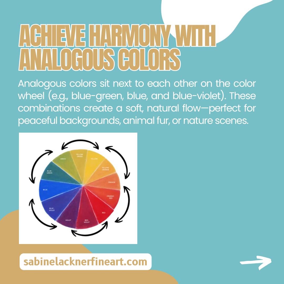
2. Achieve Harmony With Analogous Colors
Analogous colors sit next to each other on the color wheel (e.g., blue-green, blue, and blue-violet). These combinations create a soft, natural flow—perfect for peaceful backgrounds, animal fur, or nature scenes.
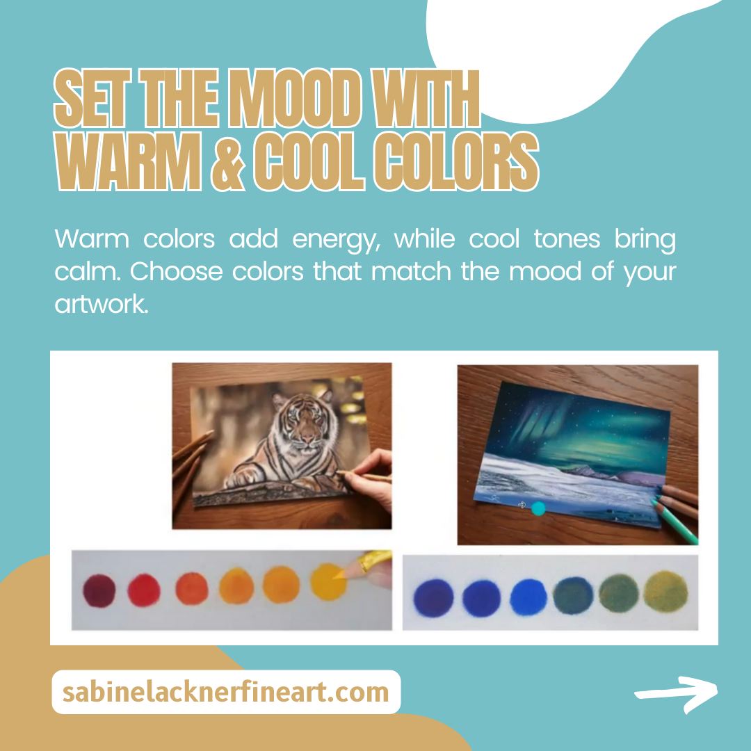
3. Set the Mood With Warm & Cool Colors
Warm colors add energy, while cool tones bring calm. Choose colors that match the mood of your artwork.
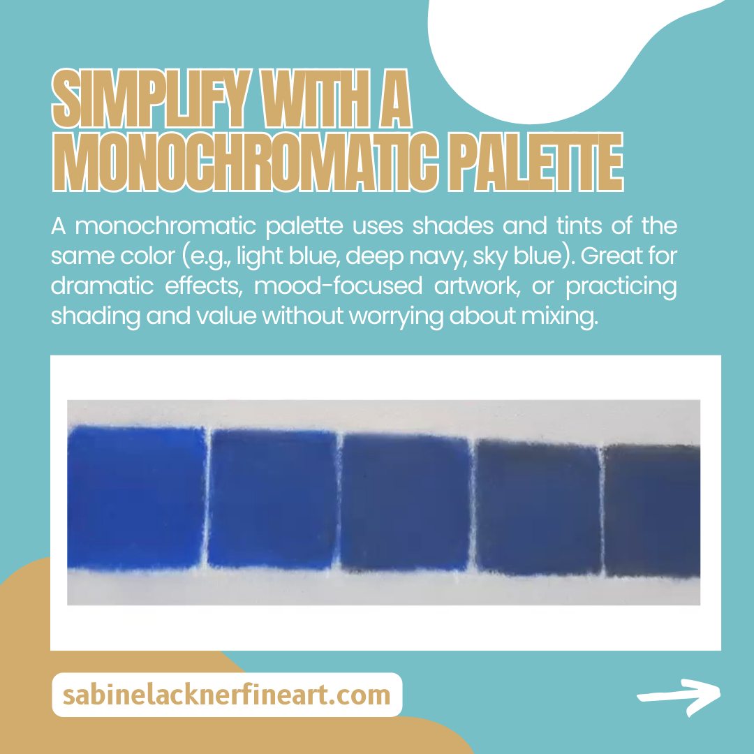
4. Simplify With a Monochromatic Palette
A monochromatic palette uses shades and tints of the same color (e.g., light blue, deep navy, sky blue). Great for dramatic effects, mood-focused artwork, or practicing shading and value without worrying about mixing.
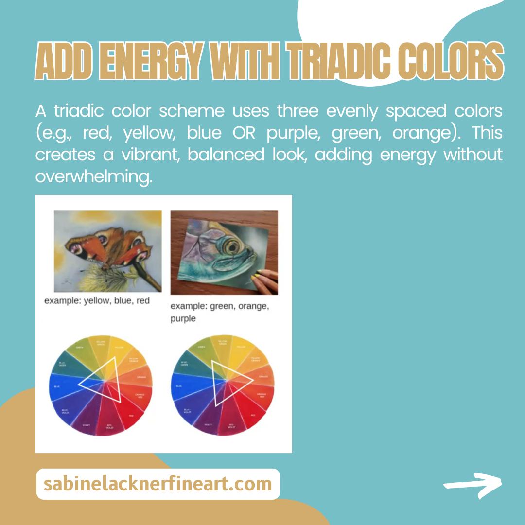
5. Add Energy With Triadic Colors
A triadic color scheme uses three evenly spaced colors (e.g., red, yellow, blue OR purple, green, orange). This creates a vibrant, balanced look, adding energy without overwhelming.

Want to start drawing realistic animals today? Click here!

Do you want to learn how to draw realistic animal eyes? Click here!

Learn about color theory, color temperature, color harmony, hues, shades, tints and tones, etc.! Click here!
If you like this kind of topics, don’t forget to follow me on my Youtube channel
or
if you want to learn how to draw realistic animal portraits, join the Animal Artclub Waitlist!


